

Introduction
Have you ever opened a beautifully designed website on your laptop, only to see it break entirely when viewed on your mobile phone? Text becomes unreadable, buttons shrink to the size of a pinhead, and images overflow the screen. This is not just a minor annoyance—it’s a significant design flaw rooted in the rigid use of pixel-based layouts. That’s where the concept of Pxless comes in.
Pxless is more than just a new buzzword in design circles—it represents a much-needed shift in how websites, apps, and digital interfaces are structured and delivered across a growing range of devices. As digital experiences expand from desktops to smartphones, tablets, wearables, and smart TVs, designers and developers are under pressure to create responsive, accessible, and future-ready designs.
In this article, we will deeply explore what Pxless is, why it’s vital in today’s technology-driven world, how it works, its core principles, its wide range of applications, and how you can start implementing Px less in your own projects for better UX and SEO performance.
What Does Pxless Stand For?
The word Pxless comes from two core ideas: “px,” which refers to pixels—the smallest visible unit in a digital display—and “less,” suggesting a minimal or reduced dependence on these fixed units. Traditional design methods have long relied on defining every element—like buttons, text, images, and containers—by assigning them exact pixel dimensions. While this approach might have worked when websites were mainly accessed on standard-sized desktop monitors, it has now become an obstacle in delivering consistent user experiences across devices.
Pxless moves away from this rigidity by advocating for the use of fluid and relative units like percentages, ems, rems, and viewport-based units (vw and vh). This creates a scalable environment where content adjusts based on the user’s screen, resolution, or device settings. In short, Px less is about building flexible, adaptable, and user-friendly digital experiences that aren’t confined by pixel-perfect constraints.
Core Philosophy Behind Pxless
At the heart of Pxless lies a philosophy grounded in fluidity, scalability, and accessibility. It promotes a dynamic approach to design where visual elements expand, contract, reposition, or reshape depending on the screen’s context rather than sticking to rigid pixel dimensions. Px less design embraces the natural variability of digital devices rather than trying to control it.
It supports inclusivity by making layouts more accessible to people with different visual abilities, allowing elements like font size or line spacing to adjust based on personal preferences or system settings. This approach doesn’t mean ignoring design discipline—it means working smarter with fluid systems that empower users rather than restrict them. Px less is about respecting user environments, embracing adaptability, and designing for diversity in the digital age.
Why Pxless Matters in the Digital Era
The digital landscape in 2025 is more complex and diverse than ever before. Gone are the days when a single screen resolution was the norm. Today, users access content through everything from ultra-wide desktop monitors to foldable smartphones, smartwatches, VR headsets, and even voice-enabled displays. Designing digital experiences for such a wide range of environments is no small feat. Fixed pixel layouts simply can’t keep up.
That’s why Pxless is emerging as a much-needed solution—it eliminates the need for multiple designs for different devices. Additionally, high-resolution displays like Retina or 4K have made pixel-based designs look outdated, causing visual artifacts, blur, or distortion. Pxless, by using scalable and resolution-independent units, ensures crisp visuals and optimal readability.
And as user expectations evolve, seamless UX is no longer optional. People demand consistent, accessible, and responsive interactions, regardless of how they access your platform. Px less delivers on that promise by meeting users where they are, on the devices they choose.
How Pxless Works
To understand how Pxless functions, we need to dive into the world of relative units. Instead of setting a fixed width of, say, 300pxa Pxless layout might set a container’s width to that 50% of its parent element. Similarly, instead of defining font sizes inpx, developers might userem, which is relative to the root font size of the page, orem, which is relative to the parent element’s font size.
These units adjust dynamically based on screen size, user settings, and zoom preferences. Px less also relies on viewport-based units like vw (viewport width) and vh (viewport height), which makes it easy to scale content based on the visible area of the screen.
This ensures that the content remains readable and well-structured, regardless of the device. Moreover, Pxless design often incorporates CSS variables and design tokens, allowing for flexible component scaling. Frameworks like Tailwind CSS and Bootstrap now support these modern techniques, making Px less implementation more accessible than ever.
Key Principles of Pxless Design
The Pxless methodology follows several key principles that set it apart from traditional pixel-based design. Fluid layouts form the foundation, using flexible grids and percentage-based widths that adjust automatically. Responsive behavior is another cornerstone, allowing designs to adapt using a combination of relative units and CSS media queries. Scalable typography and images ensure accessibility by allowing users to adjust sizes without breaking the layout. For example, setting img { max-width: 100%; height: auto; } ensures images scale gracefully.
Cross-device consistency means your design looks and behaves predictably on all screen types—from mobile phones to large TVs—eliminating the need for separate desktop and mobile versions. Lastly, Pxless improves efficiency and performance by reducing unnecessary code, minimizing breakpoints, and streamlining development processes. The result is faster load times, cleaner codebases, and improved maintainability.
Applications of Pxless
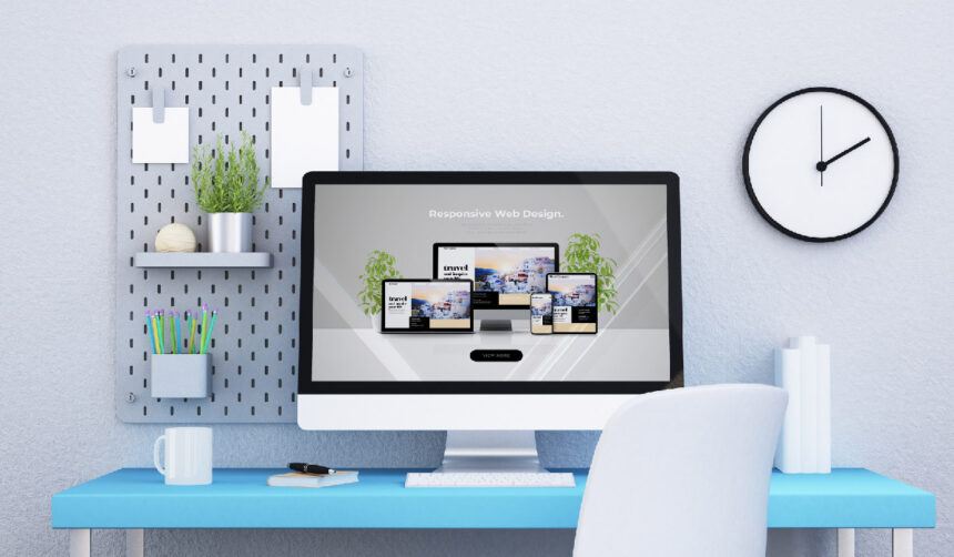
Pxless is not limited to one field—it’s a versatile concept that finds use across multiple digital domains. In web design, it allows developers to build one unified design that works across all screen sizes, instead of crafting separate versions. In mobile development, Pxless helps create interfaces that scale properly on devices with varying resolutions, from compact Android phones to large iPads.
For software dashboards and IoT interfaces, Pxless ensures that the UI remains clean and functional, regardless of the display size or platform. In e-commerce, Px less improves conversion rates by maintaining legibility and usability across checkout screens, reducing user friction.
Moreover, in accessibility and inclusive design, Px less helps websites meet international standards like WCAG by allowing users to zoom and adjust without destroying the page layout. In each of these scenarios, Pxless ensures that the experience is seamless, engaging, and universally accessible.
Benefits of Pxless
The advantages of using Pxless are both immediate and long-term. It is device-agnostic, meaning your design will look good on any screen, now or in the future. It offers better accessibility, accommodating users with visual impairments or those who prefer larger text.
Pxless is inherently future-proof, as it adapts easily to emerging technologies like foldable devices and augmented reality displays. It is also developer-friendly, reducing the need for hardcoded breakpoints or redundant media queries.
From an SEO standpoint, Pxless is Google-friendly because it leads to faster load times, lower bounce rates, and better mobile performance—all of which are critical ranking factors. Lastly, Pxless helps reduce technical debt by encouraging scalable and maintainable code, making future updates or redesigns significantly easier and more cost-effective.
Challenges of Implementing Pxless
Despite its advantages, adopting Pxless comes with certain challenges. One of the biggest hurdles is the mindset shift required from designers and developers who are used to pixel-perfect control. Design tools like Adobe XD or Figma still favor fixed artboards, making Px less workflows feel unfamiliar.
There is also the issue of compatibility with legacy systems, where refactoring old pixel-based code can be time-consuming. In some cases, rare browser inconsistencies may cause unexpected behavior when scaling elements using viewport units. Additionally, testing demands increase, as designs need to be evaluated on a wide range of devices, screen sizes, and orientations. However, these challenges are decreasing as more tools, frameworks, and communities evolve to support Px less principles.
Pxless vs Traditional Pixel-Based Design
When comparing Pxless to traditional design, the difference is clear. Pxless offers greater flexibility by using scalable units, while pixel-based design is inherently rigid. Px less ensures excellent device compatibility, while fixed layouts often fail on non-standard screens.
Accessibility is superior with Pxless, as it supports dynamic adjustments, whereas pixel-based designs often break with zoom or font scaling. Maintenance becomes easier and more scalable in Px less, reducing effort for updates and redesigns. While the learning curve for Px less may be moderate, its long-term benefits significantly outweigh the short-term discomfort.
How to Implement Pxless in Real Projects
Implementing Pxless starts with using fluid layout systems like CSS Grid and Flexbox, which allow elements to grow and shrink based on available space. Designers should replace all fixed px values with relative units such as rem, em, %, vw, and vh. Creating scalable components using CSS variables makes it easy to adjust global sizing across your project. For typography, modern CSS features like clamp() enable font sizes to respond dynamically to the viewport.
For instance, font-size: clamp(1rem, 2vw, 2rem); ensures readability on both small and large screens. While Pxless discourages over-reliance on breakpoints, you can still use media queries for enhancements, not layout foundations. These steps pave the way for fluid, responsive, and accessible web experiences.
Real-World Examples of Pxless Use
Several major platforms already embody Pxless principles. Google’s Material Design uses scalable spacing and typography that adapt to different screens. Shopify’s Polaris design system is largely based on rem-based layout logic. Companies like Apple, Notion, Airbnb, and Stripe prioritize responsive-first designs that work seamlessly across devices. You can also apply Px less directly in your own projects. A basic web template might look like this:
This simple code ensures that text and images scale fluidly, providing a smooth user experience across screen sizes.
SEO & Accessibility Advantages of Pxless
In terms of SEO, Pxless has a direct impact. Google’s mobile-first indexing prioritizes responsive and fast-loading sites. Px less helps you meet both requirements with ease. It also contributes to ADA and WCAG compliance, as users can zoom and change font sizes without breaking layouts. This improves inclusivity and protects your business from potential legal risks. From an analytics perspective, reduced bounce rates are a welcome bonus, as users are more likely to engage with content that displays correctly and is easy to navigate, regardless of the device.
Future of Pxless Design
The future of Pxless is incredibly promising. Tools like Figma are introducing responsive design tokens and auto-layouts that make Px less workflows smoother. AI tools are beginning to generate fluid design systems, automatically adapting interfaces based on device type or user behavior. Design automation platforms are also evolving, enabling developers to create component libraries that are fully Pxless-ready out of the box. The CSS community is moving toward adopting container queries and improved fluid typography features that align directly with Px less principles. This indicates a future where Px less becomes not just an option but the standard in digital design.
Pxless Checklist (for Designers & Developers)
-
✅ Use
%,rem,vwinstead ofpx -
✅ Use
clamp()for fluid typography -
✅ Design with Flexbox or Grid
-
✅ Set images to
max-width: 100% -
✅ Avoid fixed widths and heights
-
✅ Test on real devices and screen sizes
-
✅ Use media queries only for enhancements
Final Thoughts
In conclusion, Pxless represents the next logical step in the evolution of digital design. It moves us beyond the outdated limitations of pixel-based layouts and into a new era of scalable, responsive, and user-focused experiences. As more devices and screen types emerge, Pxl ess ensures that your designs remain functional, inclusive, and visually consistent—without the need to rewrite your entire layout for every screen. Whether you’re a solo developer, a UX designer, or part of a large product team, adopting Px less today will give you a strategic advantage tomorrow. The world of digital design is fluid, and Px less is the toolset that ensures your work flows beautifully with it.
FAQs About Pxless
1. What is Pxless in simple terms?
Pxless is a design approach that avoids fixed pixel sizes and instead uses flexible units like %, rem, and vw to create layouts that adjust to any screen size. This makes websites look good on desktops, tablets, and mobile phones without breaking or resizing issues.
2. Why should designers use Px less?
Designers use Pxless to make websites and apps more responsive, accessible, and easier to manage across different devices. It helps content scale automatically without needing separate designs for mobile and desktop.
3. How does Pxless improve user experience?
Pxless improves user experience by allowing text, images, and buttons to adjust smoothly to any screen. This means users can read and interact with content comfortably, no matter the device they are using.
4. Can Pxless help with SEO?
Yes, Pxless helps with SEO because it improves mobile responsiveness, reduces bounce rates, and speeds up load times. Google favors websites that are easy to use on all devices, and Pxless supports that goal.
5. Is Pxless hard to learn or use?
No, Px less is easy to learn if you know basic CSS. It mainly involves using relative units like %, rem, and vh instead of px. Tools like Flexbox and CSS Grid also make it easier to build Px less layouts.
Read More: PPV Land Explained: Powerful Guide to Live Sports Streaming
For More Information, Visit Emperormagazine